Streamlining video games has become the ‘in thing’ for video game development these days. Most games have benefited from the streamlining touch, with improved gameplay and making everything all around user friendly for the player.
Unfortunately, several others have dropped the ball either by making games too simple or creating a sequel that lacks the soul of the original. Here’s a short list of games that have been some of the worst offenders.
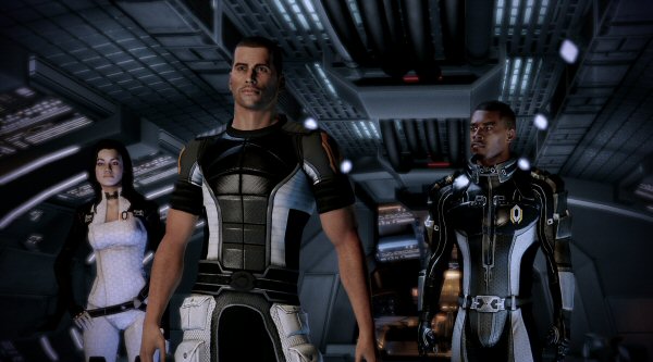
Mass Effect 2
The very first Mass Effect was the perfect sci-fi RPG with complex armor and weapon systems as well as having the massive Milky Way galaxy to explore. But when Mass Effect 2 was developed Bioware decided to refine all of those RPG essentials.
Instead of having the ability to explore an open area on a planet you’re now forced to follow a linear side-mission instead. While this allowed for more action-packed sequences, I no longer had the joy of being able to scour an uncharted planet.
While it was certainly admirable of Bioware to attempt it actually made me disinterested in the rest of the series.
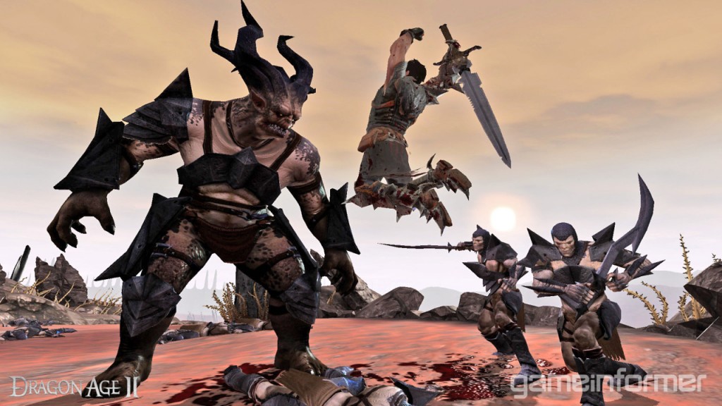
Dragon Age 2
Many of the games and sequels on this list have ruined one or two mechanics by giving them the streamlining treatment. Dragon Age 2 somehow managed to dumb down nearly every aspect of its gameplay.
Bioware scaled down the game world to a single city, re-used dungeons and made the difficulty balance, well, incredibly unbalanced. Once again, Bioware attempted to strip back the essential elements for any RPG for the sake of more accessibility.
Or the more likely explanation: this game is just a rushed, oversimplified piece of work.

Final Fantasy XIII
Final Fantasy has left its signature on the history of video games and RPG’s, but unfortunately streamlining went horribly awry once again for this game. Square Enix ultimately took every essential exploration element from a RPG and did away with it.
Talking to NPC’s, lack of free-roaming capabilities and fewer towns turned it into a one way track to boss fights. While many reviewers praised some of these designs, to me, you’re still just taking away the most basic parts of the RPG experience.
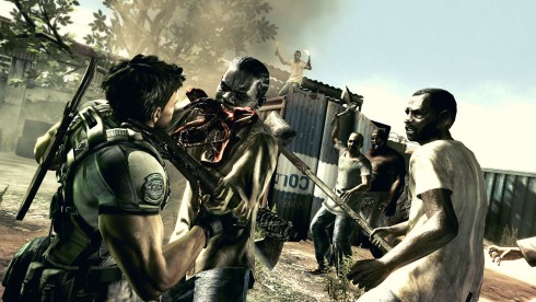
Resident Evil 5
Resident Evil (RE) first tested streamlining its gameplay with Resident Evil 4, but it still offered the same scare and thrills every RE game before it had. Sadly, the same can’t be said for Resident Evil 5.
While it’s still a kickass action shooter…actually that answers the question. Sticking with the more linear levels and action sequences have taken over the once thought provoking puzzles and shocking scares.
Hopefully Capcom will take the time to bring back more challenging and hair raising gameplay back to Resident Evil 6.

Fable 3
Ah, Fable. You started out so well. But the constant refinement has caused the series to take a serious downward turn. Fable 2 faced some small streamlining to its HUD, but it became a better game than its predecessor.
As for the third game it seem like Molyneux got a little to experimental with his design ideas. Lionhead took a shot at having players play the game without a menu screen and instead had you access a room when you hit start. It allowed you to never leave the in game experience, but it wasn’t exactly functionable.
Having to walk in and out of rooms and dealing with more than one loading screen isn’t exactly my idea of user friendly.
Note: Most of my opinion came from firsthand experience with these games, excluding FF XIII and Dragon Age 2.

You forgot to mention Skyrim and Oblivion.
[…] some more insight on how developers can improve games, Five Games Where Streamlining Went Wrong. Senior Stiv spends his time going back and revisiting games of old, check out his Overdue Review […]
SPORE!!